At a glance
- Dates
- –
- Context
- ENEDIS (EDF Group), Languedoc-Roussillon Mapping Department, Montpellier, France
- Technologies
Overview
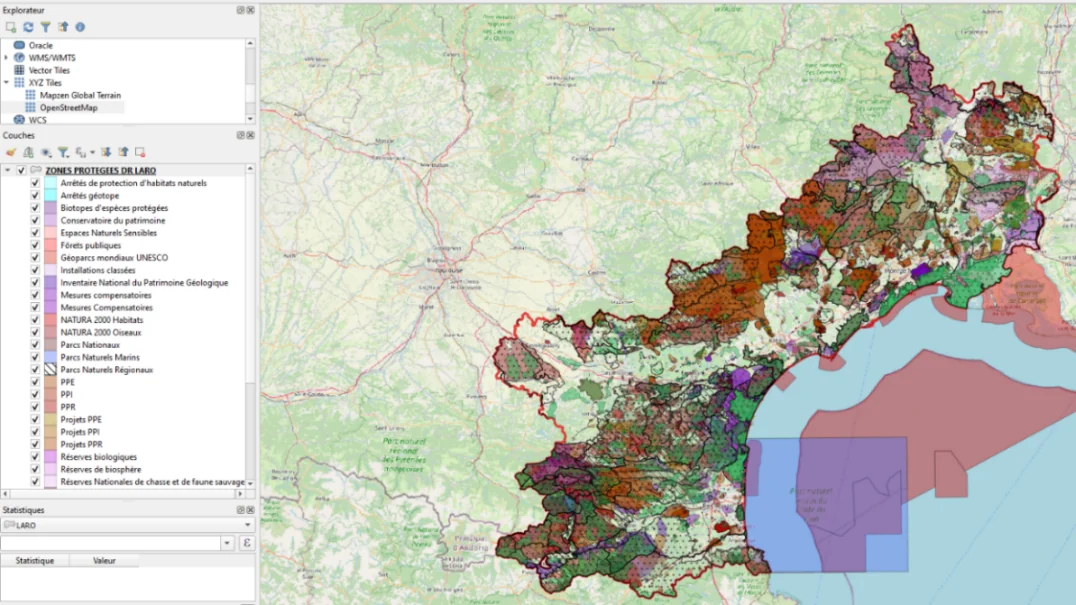
- Built territorial data study grids in QGIS and ArcGIS.
- Data sorting with Python and Power BI.
Context
Two months in the GIS unit of the mapping department, at the Languedoc-Roussillon regional division. The unit had just been created: the subjects I was given were groundwork projects, later shared with the GIS specialists of the other regions.
Two mapping applications to deliver, each with its data, its search tools and its user guide.
What this internship shows
- Data management: extraction, cleaning, schema normalisation, joins, de-duplication.
- Spatial analysis: clipping, merging, dissolving, snapping points to a network.
- Development: a Python script (arcpy), web mapping applications, infographics.
- Autonomy: two projects taken from raw data to a delivered, documented tool, in two months.
Project 1 — Mapping protected areas
Goal: for any construction site or maintenance operation, know which environmental protections apply at that location.
- Collect 33 public datasets of protected areas (IGN, Cerema…): Natura 2000, national and regional parks, reserves, ZNIEFF inventories, water catchment perimeters…
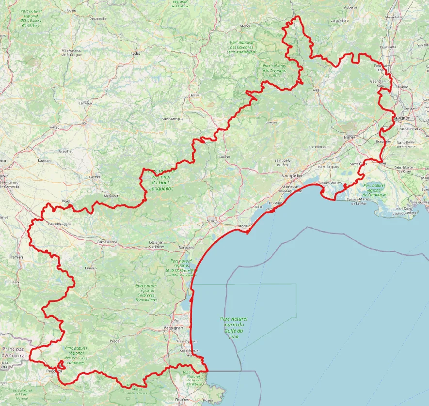
- Clip each layer to the perimeter of the regional division.
- Digitise by hand the only layer supplied as an image: outlines redrawn, then attached to their municipalities.
- Normalise the attribute tables to a common schema: without it, merging would have lost data.
- Merge everything into a single table of 10,058 rows and 19 columns.
- Overlay these areas with the network layers and publish the map in a web application.
An impossible total, and its fix
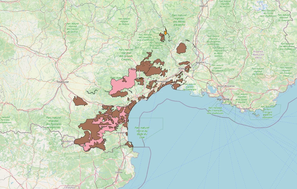
The first calculation of the network lengths located in protected areas gave an unrealistic total. The cause: protected areas overlap, and the overlay copied each line segment as many times as the number of areas it crossed.
- For the total: first dissolve the areas into a single layer with no overlap, then overlay it with the network.
- For the breakdown by type of area: a Python script (arcpy) groups the segments by type and identifier, then adds up the lengths without duplicates.
The delivered application
An interactive web map, published on the company’s internal mapping portal (ArcGIS) and designed from the user’s point of view.
- Search for an asset by its code, with automatic zoom.
- Filter by type of protected area.
- List of the assets in a municipality or within a radius, with a printable PDF report.
- Infographics of network lengths by type of area.
- Legend, basemaps, distance and area measurements.
- A home page and a 20-slide user guide.
For confidentiality reasons, the applications are not shown on this page.
What I take away
- Check types and schemas before publishing a layer: plan from the start how the data will be joined and analysed.
- Put yourself in the user’s place: an application is only finished with its guide.
- Document and tidy what you add to a shared database.
Project 2 — Climate risks and costs
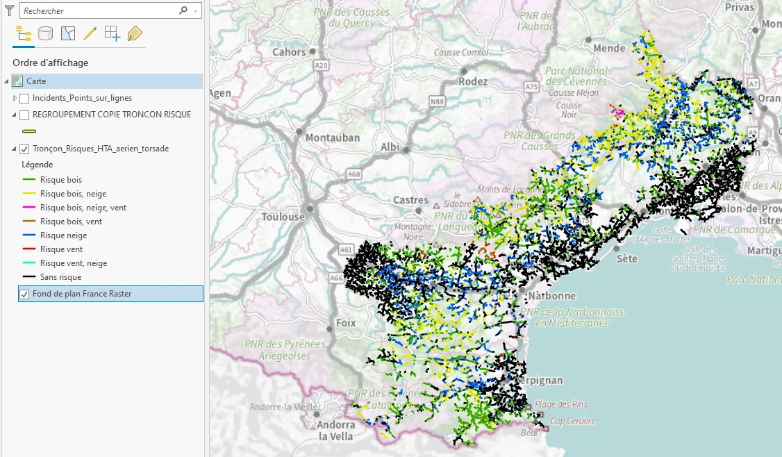
As part of the climate hazard plan requested by the energy regulator: identify the overhead medium-voltage line segments exposed to trees, wind or snow, and relate them to past incidents and operating costs, to help prioritise works.
| Data problem | Answer |
|---|---|
| Incidents located beside the lines | Coordinates were recorded from the maintenance vehicle. Each incident is attached to the nearest segment, then moved onto it: an approximation, stated as such. |
| Costs known per feeder, not per segment | Segments are grouped by feeder before the join, so that the same cost is not counted several times. |
The data is then filtered and brought together in a mapping application built to visualise it: risks, incidents and costs on a single map.
Results
- mapping applications delivered, each with its user guide
- 2
- public datasets assembled
- 33
- rows in the normalised table (19 columns)
- 10,058
- of internship, 35 hours a week
- 2 months
At the end of the internship, the layers and applications were tidied in the shared database (descriptions, names, tags, categories) so that others can keep using them.
For confidentiality reasons, the two applications are not shown and this page gives no internal figures; the network only appears at regional scale, on the risk map.